Visit bnymellon.com
Overview
I helped BNY Mellon with their digital transformation by translating their refreshed brand identity into a user-friendly, scalable, and secure digital platform. The project aimed to attract new talent and align with the tech-driven mindset, while maintaining consistency and ensuring a seamless experience for users managing financial assets.
The old site was lacking a digital-driven experience.
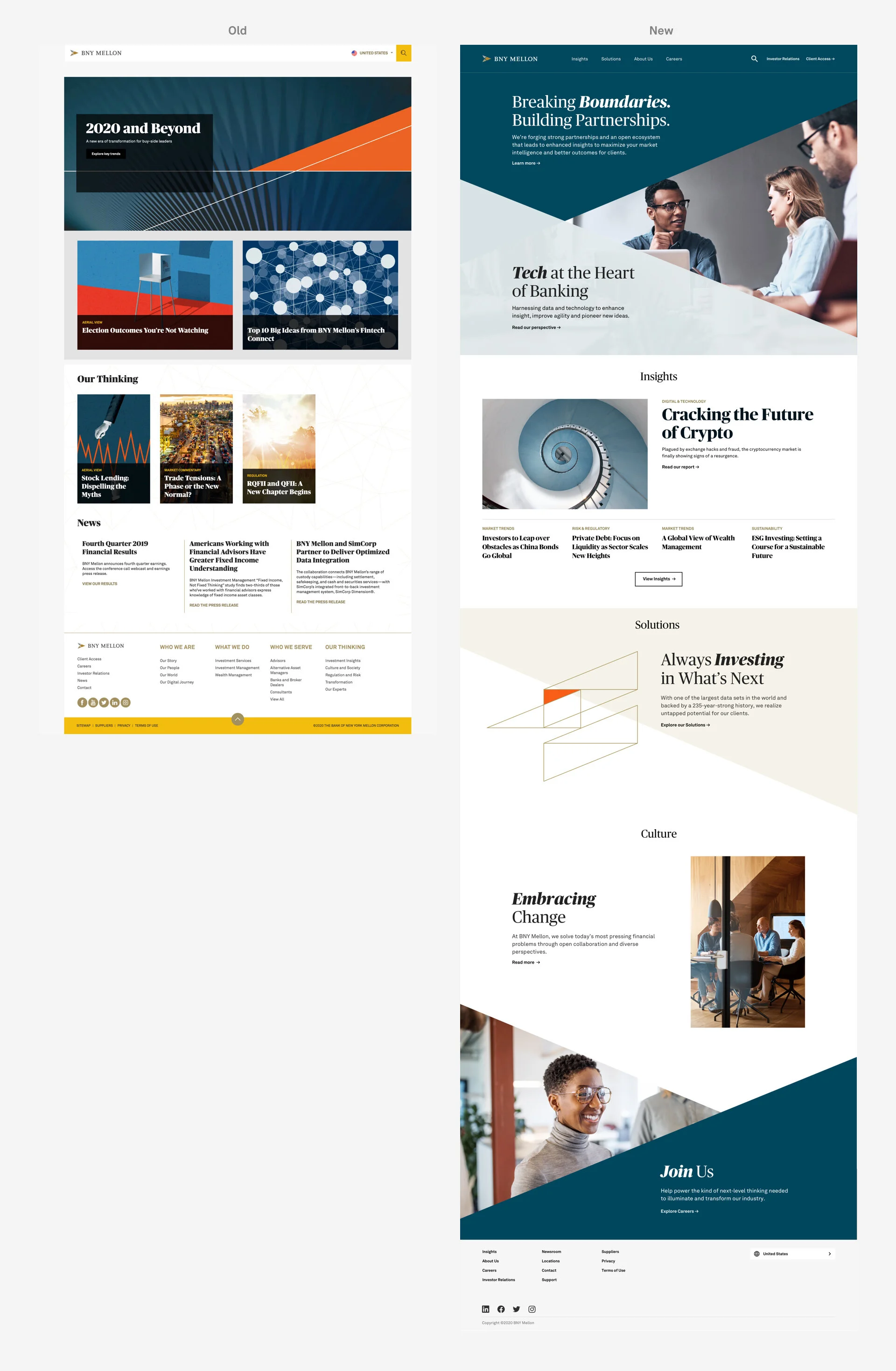
The previous website showcased a new brand identity, but was missing the brand's message due to cluttered content layouts. This led to high drop-off rates during the user's journey on the pages.
the Ask
Create a new website that effectively translates the new brand identity onto the digital platform
Build a new digital system
The web system should be applicable to their own CMS platform
MY ROLE
Senior Product Designer, a collaboration with Associate Creative Director / Designer
Product Design System/ Components Creation/ Site Annotations / Documentations
Creative Research & Site Design / Development
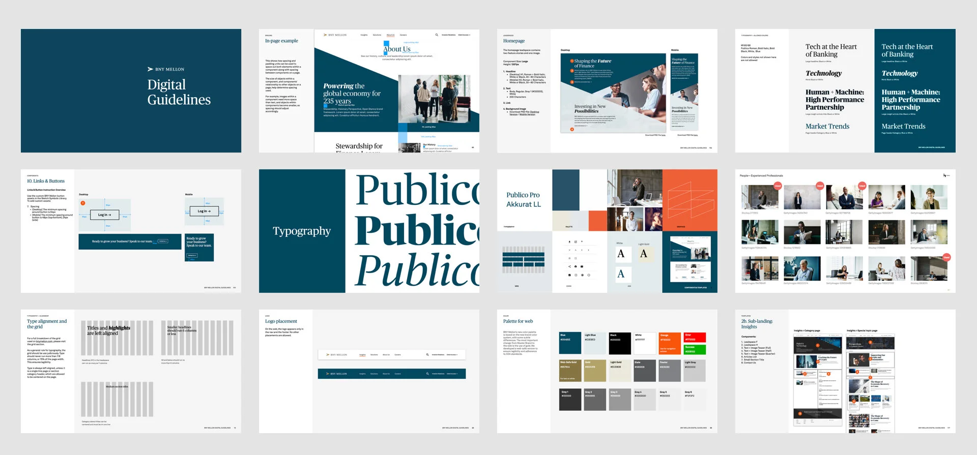
Authored guideline
Photography Art Directions
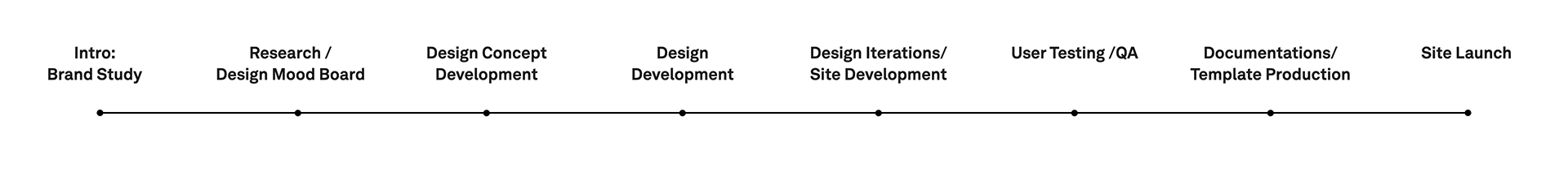
The Process
Throughout the entire process, from concept to final delivery, my role was to actively engage in every step and collaborate with UX, content strategy, and account teams to create an optimal .com experience.
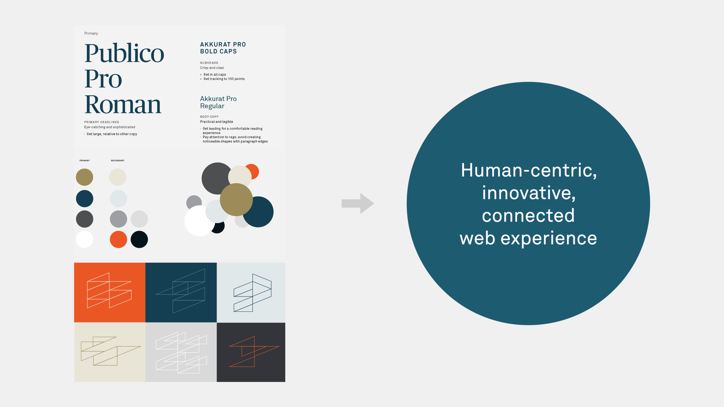
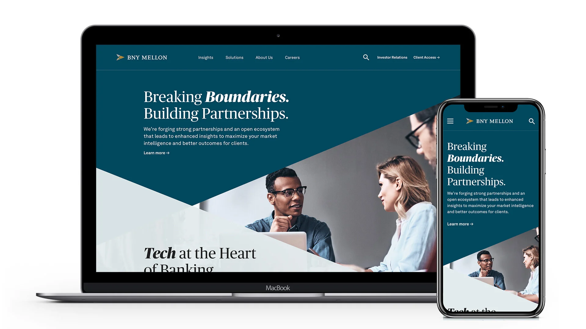
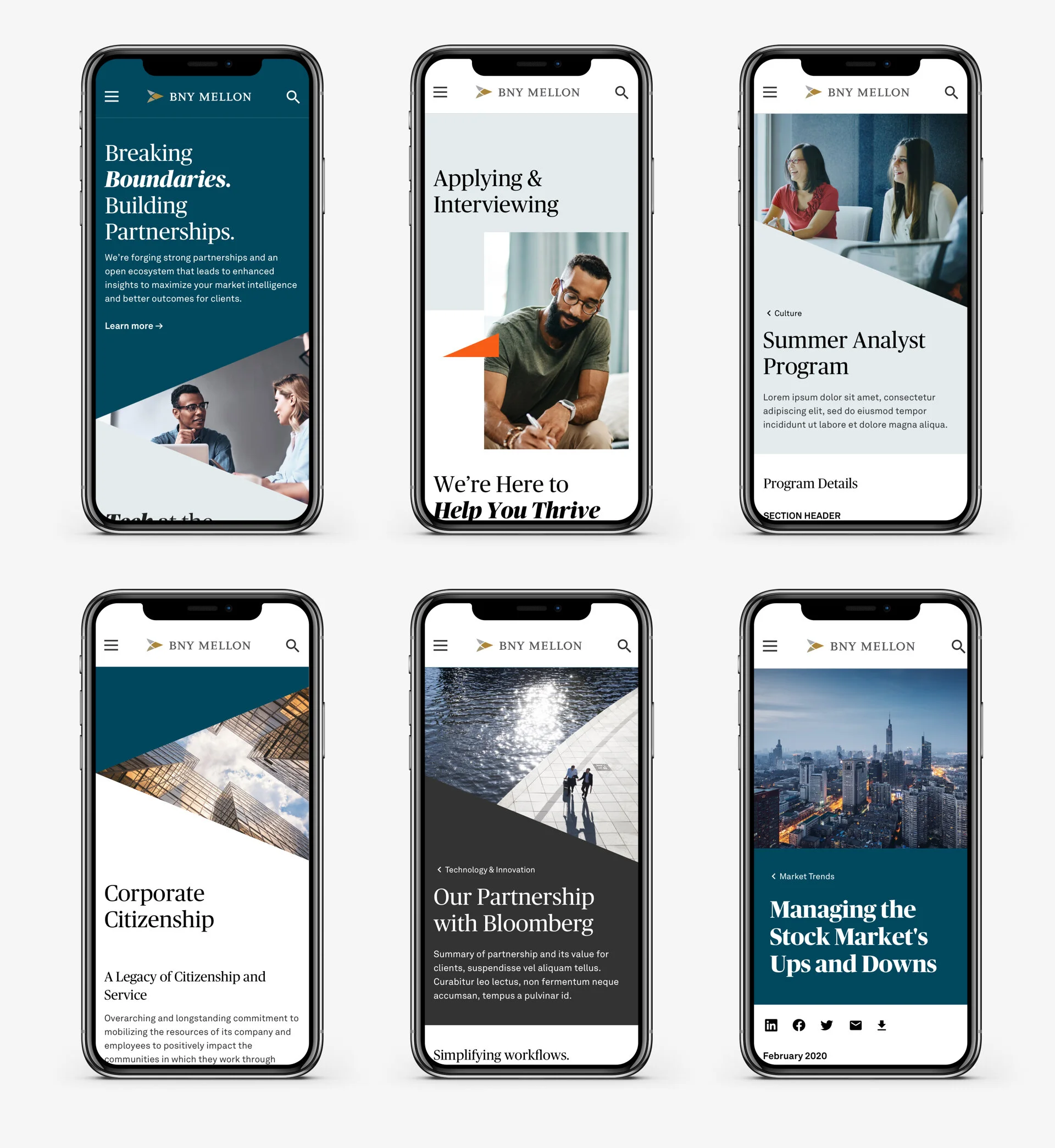
The new master brand had a minimalistic approach, consisting of simple typesetting, a basic color palette, graphic element exercises, and a few photo directions.
The primary challenge was to effectively utilize the brand assets and harmonize them with UX and content strategy.
To begin with, I conducted extensive creative research.
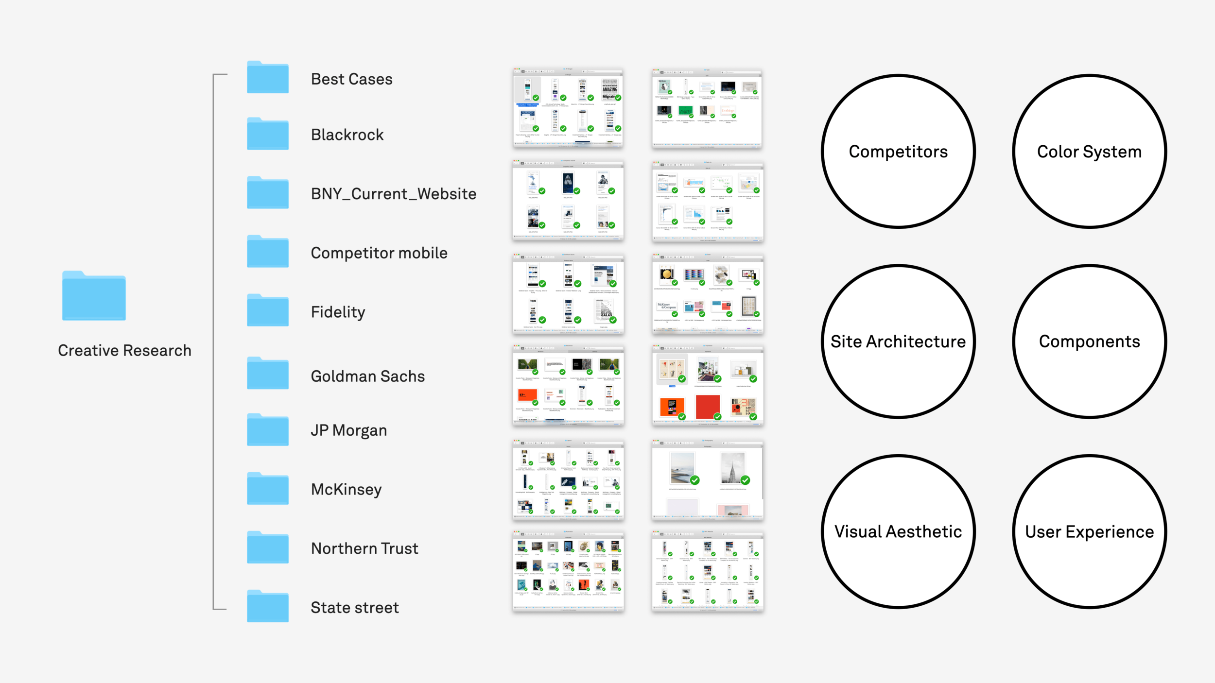
I researched competitor sites to learn how they utilized branding elements, structured information, and created overall site experiences. I categorized my findings based on best practices for navigation, visual structure, photography, and component types.
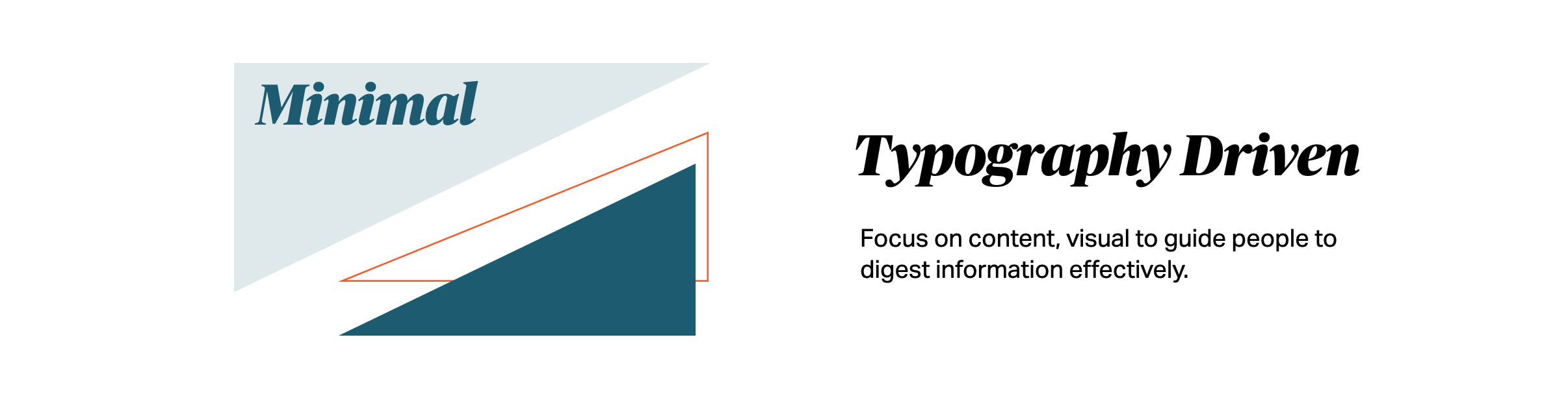
My goal was to create a lasting and impactful impression of BNY Mellon within seconds of visiting the webpage. To accomplish this, I prioritized content and incorporated solid visual support to enhance the page experience.
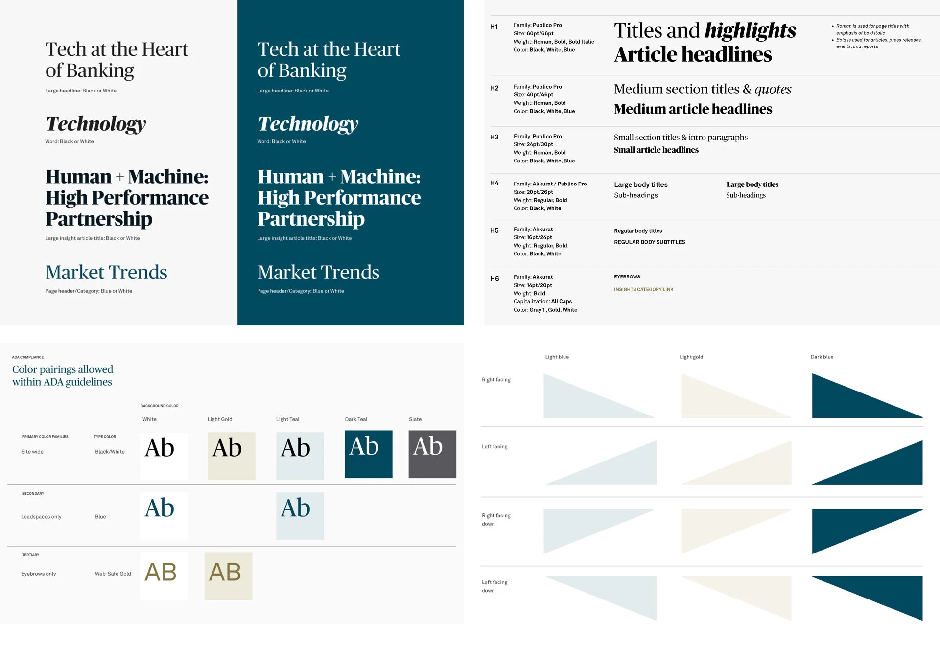
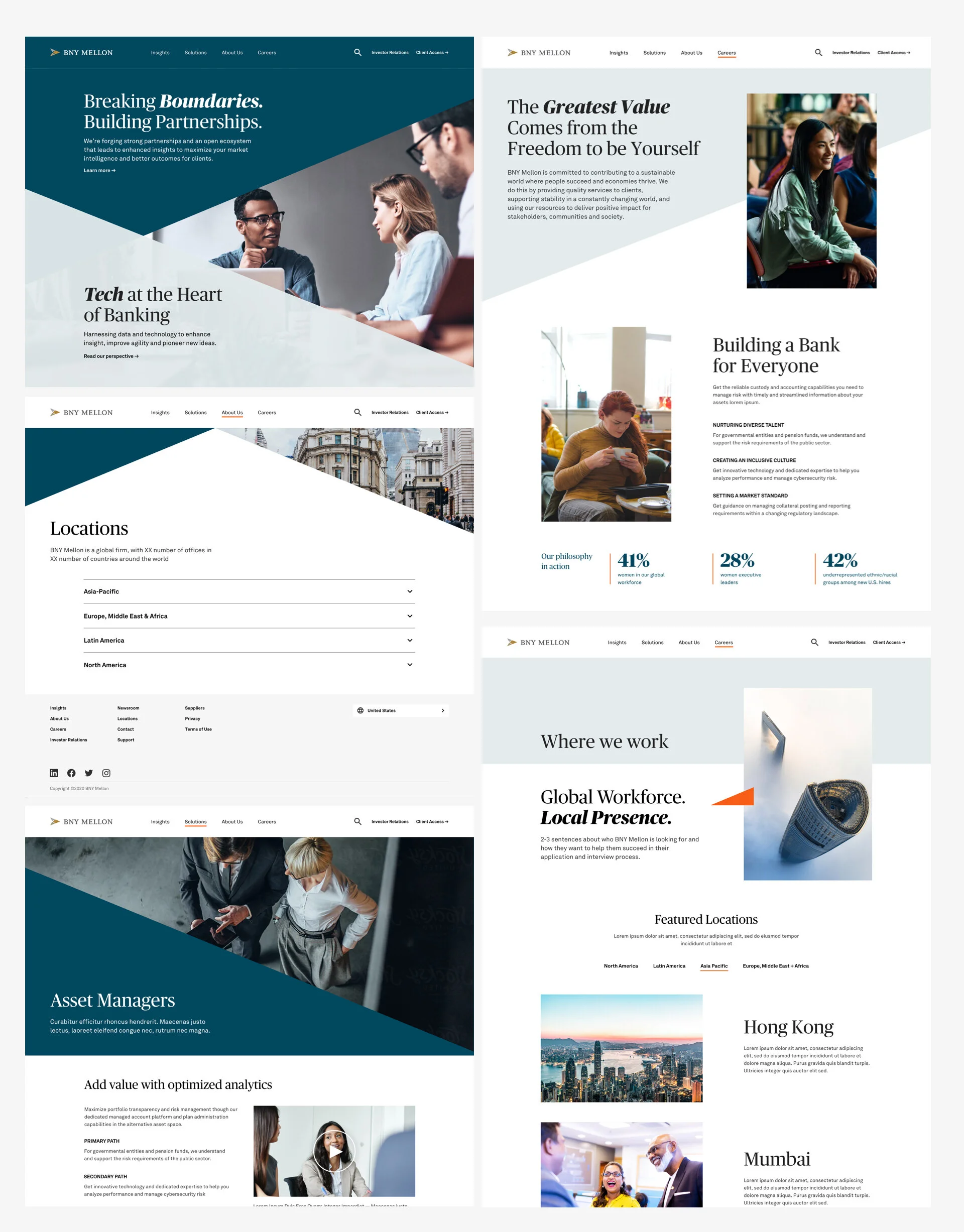
Setting up a solid foundation was essential. Worked with ACD, I created a clear type hierarchy, UI element rules, shape exercises, and color & type combinations that meet ADA compliance.
Collaboration with ux
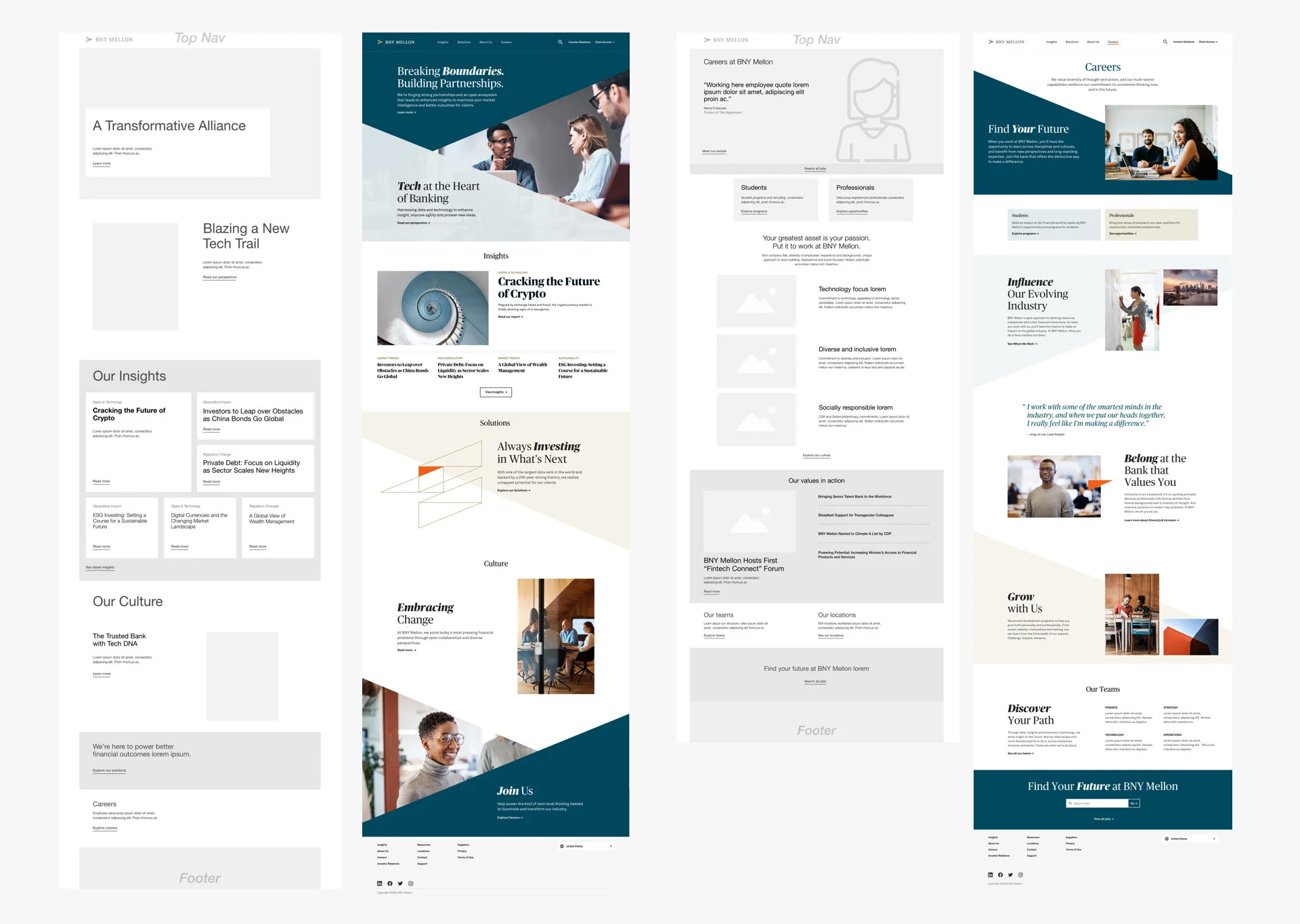
I worked closely with UX designers and content strategists to establish the site structure, which involved wireframing, selecting components, and determining the layout hierarchy.
Design Direction
I decided that the visual direction should prioritize content, allowing users to quickly and efficiently scan and digest the information. With minimal direction from the brand guidelines, I opted to build an extensive photo library to enhance the brand storytelling. Additionally, I incorporated triangle symbols and carefully selected colors throughout the pages to create a cohesive design aesthetic.
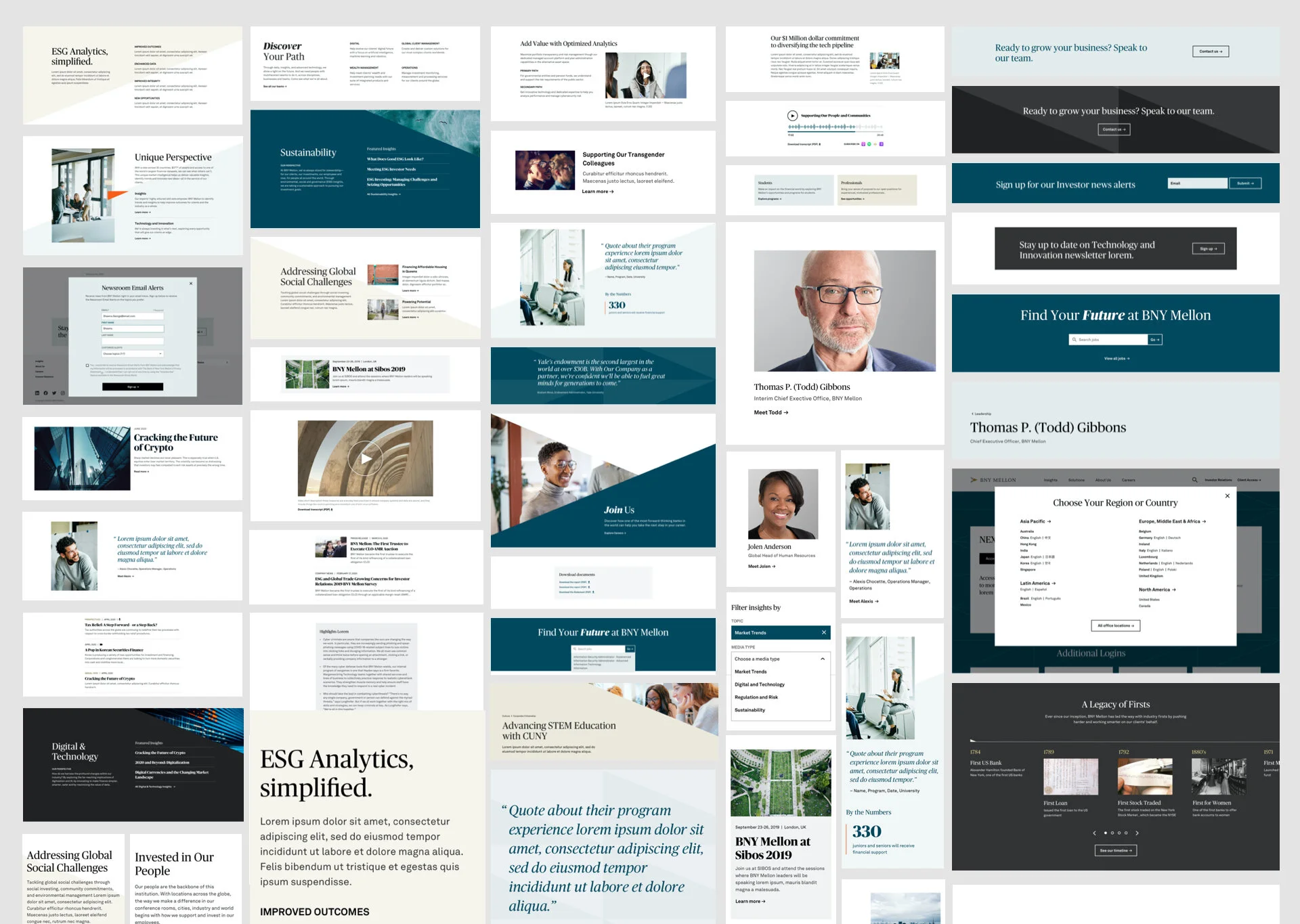
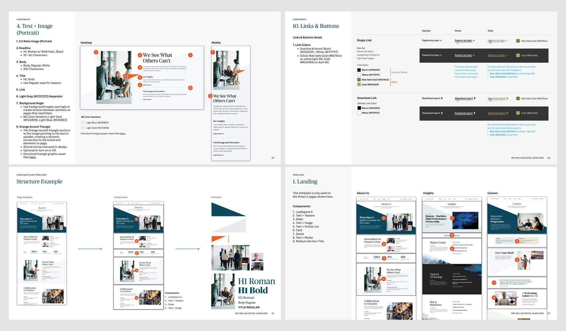
Component library
I created components that were easy for admin users to assemble, much like building with lego blocks. I measured and tested various combinations of these components to ensure that each variation created the appropriate harmony within a single page.
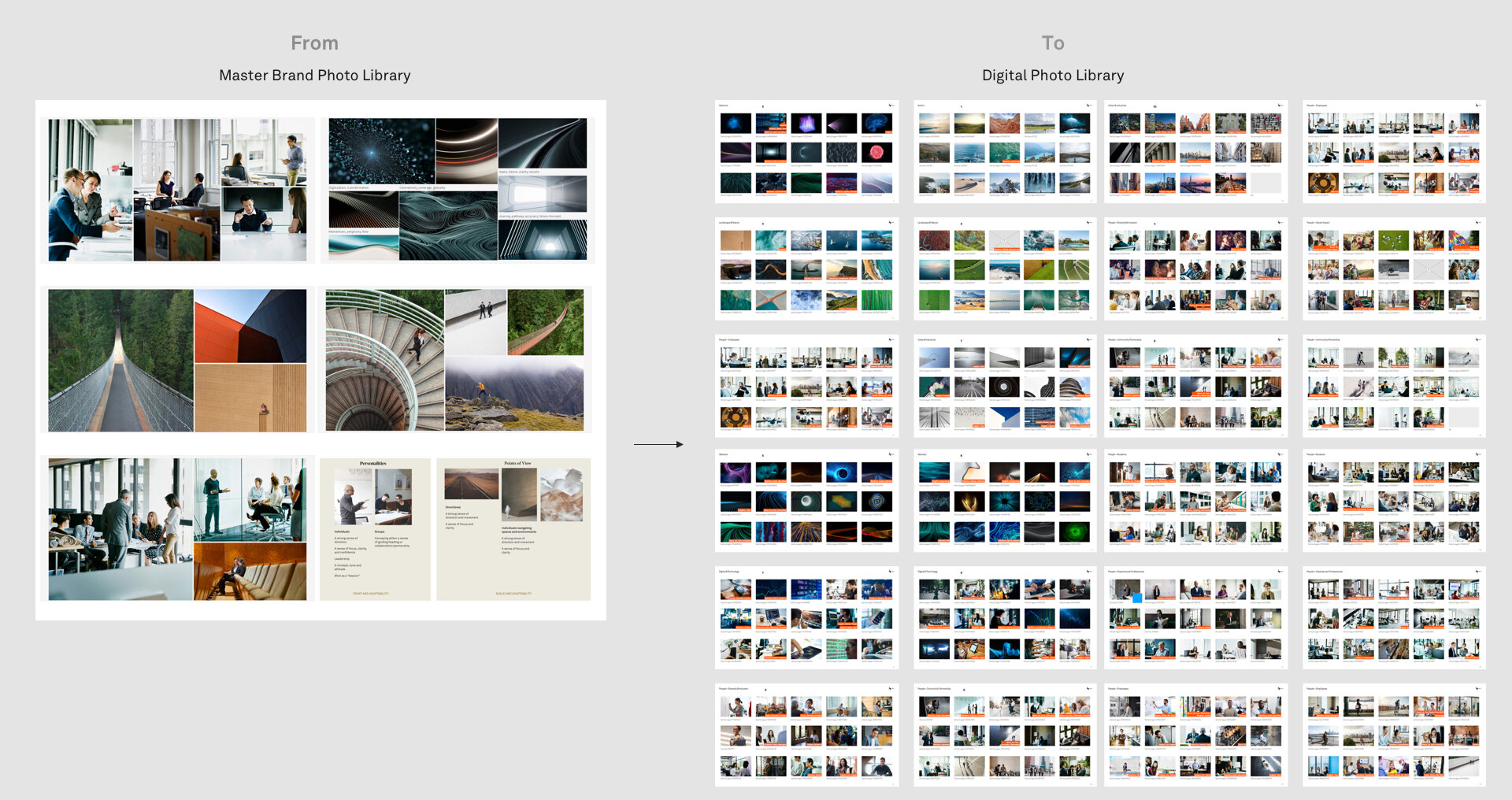
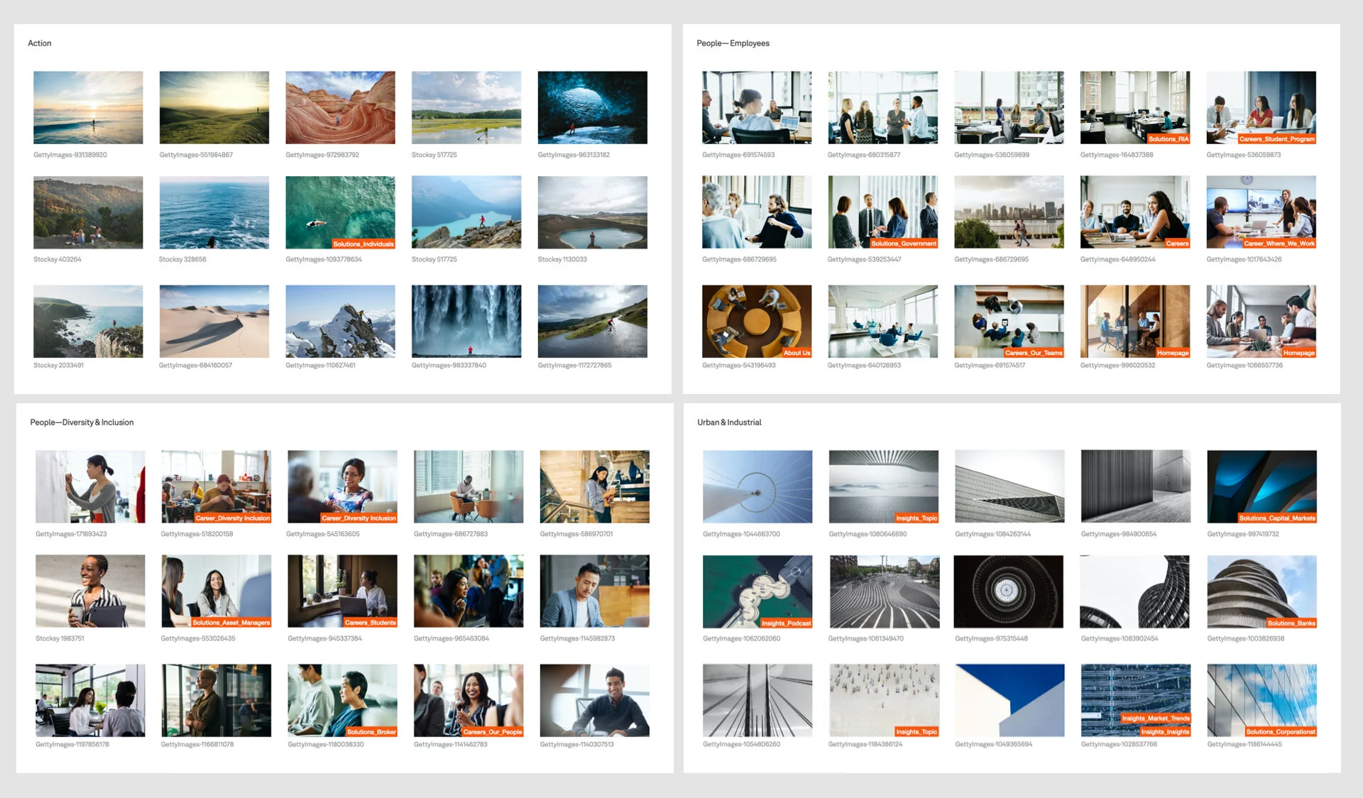
Extensive photo library
One of the standout features of the digital system was the scaled photo library, which played a primary role in expressing brand’s tone of voice. To achieve a purposeful storytelling journey throughout the site, I created an extensive photo library that encompassed a wide range of content, including digital and technology, global finance, urban lifestyle, and people in various settings. To ensure diversity, I categorized the photos based on actions, landscapes, and indoor/outdoor human activities.
Last but not least, guideline creation.
I recognized the importance of consistency and created a comprehensive set of digital guidelines, comprising 190+ pages, to ensure the new digital system worked seamlessly within BNY Mellon's CMS platform. These guidelines included detailed site annotations and a style guide, providing clear instructions for the use of design elements, typography, and color palette.
Result
BNY Mellon was able to achieve their KPI goal and we saw an increase in total site visits, as well as more business inquiries through the web. One month after the launch, BNY Mellon experienced longer engagement times, lower drop-off rates, and an increase in job applications from both young and senior candidates.